BODY BY LOCKWOOD
LOGO AND BRANDING
Body by Lockwood is a home gym personal training business located in Seattle, WA. The objective was to create a holistic brand that felt comfortable and natural while conveying strength and elegance. Upon design, I wanted to avoid creating a brand image that personified cookie cutter.
Design brief
There is no one-size-fits-all when it comes to building a brand and logo for physical fitness trainers. This being the case, I needed to know what kind of impression the brand was aiming for and what they were about.
To kick off my client research, I formulated some questions:
- If your brand were a person, what adjectives would you use to describe it? (natural, strong, successful)
- What is your brand voice? (masculine, neutral)
- What beliefs and values are essential to your brand?
- What do you offer that your competitors do not?
- How would you like others to describe your brand?
Findings
Luckily my client was able to articulate what they wanted their brand to represent without much effort. The following answers were significant contributors to the design direction.
Question 1: If your brand were a person, what adjectives would you use to describe it? (natural, strong, successful)
- Confidence
- Strong
- Natural
- Process-oriented
- Personal
- Top-notch
- High end
- Successful
- Organic
- Friendly
- Personable
- Approachable
Question 2: What is your brand voice? (masculine, neutral)
"I don’t want the brand to portray masculinity. I want to work with all types of clients; young, old, male, and female."
Question 3: What beliefs and values are essential to your brand?
“Being vegan for the last couple of years has taught me that you don’t need to eat rice and chicken to see significant results. I believe that if done right, you can make significant gains in your fitness with a dedicated balanced meal plan and the training I provide. That’s not to say I work with only vegans; I can help build a plan oriented around the things you love to eat.”
Question 4: What do you offer that your competitors do not?
“I come to you. Plain and simple. Because I focus on high-end apartment and condos that have in-home gyms, we do all the training without ever having to leave your building.”
Question 5: How would you like others to describe your brand?
“I want others to describe me as a fun alternative to their normal gym routine. I incorporate many of the sports-oriented workouts I’ve learned over the years that get you moving, laughing, and sweating all at the same time.”
Industry Discovery
During this phase of the process, I began to research what kinds of logos competitors and industry leaders have. Doing so allowed me to know the difference between a logo that is generic and one that is way out in left field.
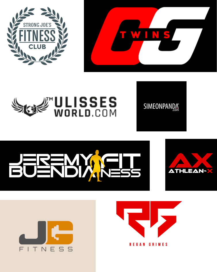
As the examples show, logos tend to be text-heavy, bold, and incorporate accents of gym equipment, and body silhouettes. Red, yellow, and orange stand out from among the crowd with blacks and greys as accents or the only color choice.
I find there is a lack of a logo mark or something non-text one could associate with the brand.
Color exploration
As I was selecting a color, I wanted to deviate from what I found above. I used a bit of color theory to help guide me. Color in and of itself encompasses a multitude of definitions. Green, for instance, is universally associated with nature, ecology, and the environment. Purple symbolizes magic, mystery, spirituality, sub-conscious, creativity, dignity, and royalty. Blues are associated with cleanliness, strength, dependability, and coolness. While these meanings are not complete, they, in addition to the question above, helped guide my selection.

Color palette

A mixture of green and blue with a grey accent worked well to separate the logo from the pack as well as encompassing the strength and nature connections found above.
Concepts
I played around with the idea of a leaf as a focal point. The leaf in and of itself symbolizes heath and nature, two of the primary wants. I worked for a more natural and elegant look but eventually moving toward something a bit more modern.
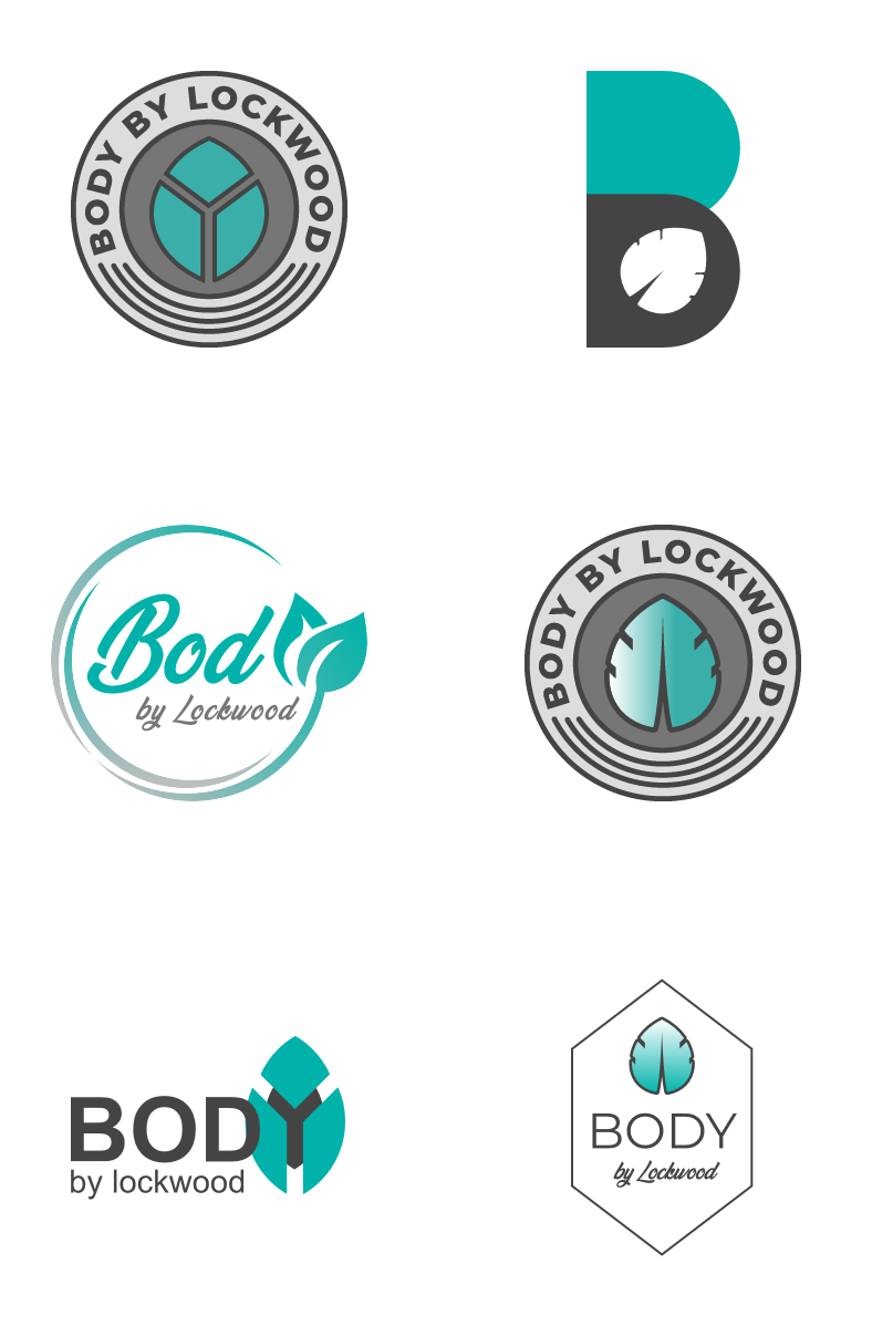
Selected Design
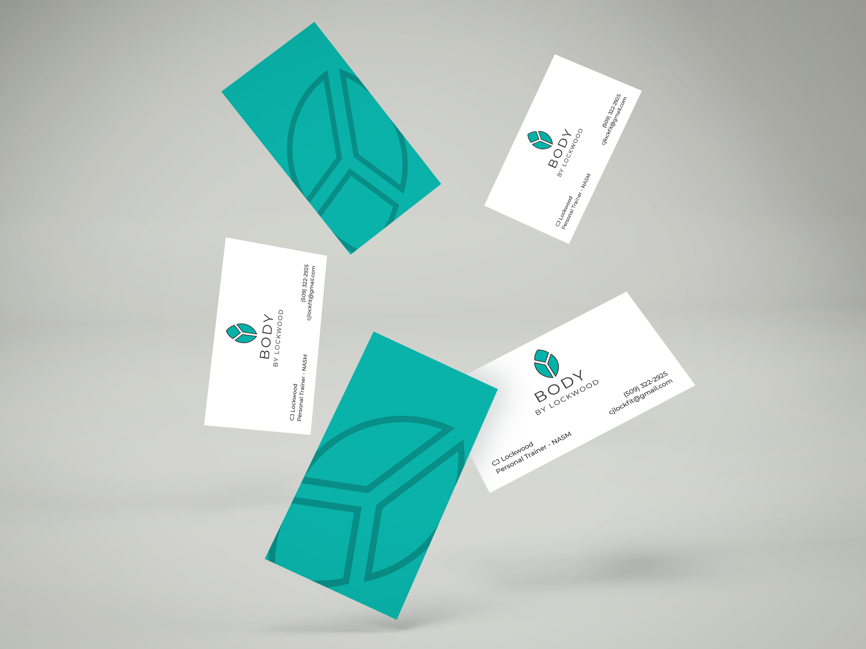
Visual Identity: Business card concepts
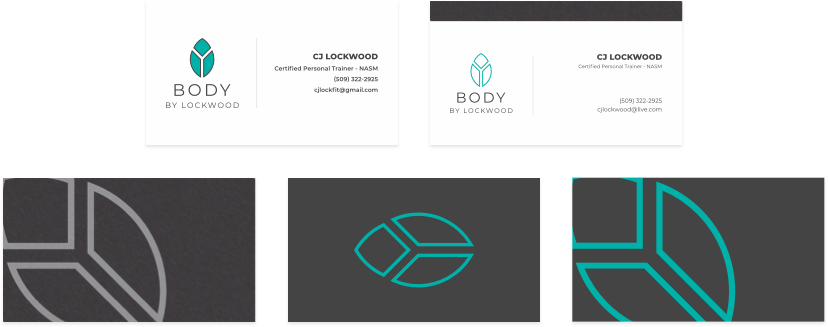
Visual Identity: Selected design

